We are well into the swing of softball season and a couple teams got themselves new logos!
Master Batters
The Master Batters got a simplified logo for their new jerseys.
Original Logo
Unfortunately there wasn’t an original digital file so I had to recreate the bats.
New logo
Wedler Wombats
The Rendezvous Restaurant closed down this year so the ‘Vous Crew were in need of a new sponsor and logo. Wedler Engineering stepped up to the plate and sponsored the team who are now called the Wombats 😊
Justine needed a logo for her new business that offers unique gifts & gift baskets for special occasions. She wanted something “simplistic that used the name to play on the wrapped up aspect” of the products and services she offered. She also wanted a “ribbon swirl” incorporated into the logo. After a bit of back-and-forth with various logo concepts and colours, this is the final result…
Light version
Dark Version
If you are looking for a custom gift or gift basket, check out Justine’s socials:
With Ever After Character Company closing their doors, my daughter & daughter in law, Shelby & Deanne have picked up the mantle and have started Chilliwack's new character party and event company; A Little Moore Magic
They would love to create a fun and joyful experience for your future events and gatherings.
Aside from the graphic arts side of things, my other hobby that consumes a significant amount of time is softball; specifically Slo-Pitch. I have been playing in the Wildlife Slo-Pitch League for over 25 years and 2023 will mark my 15th year as league president. I also started up Chilliwack Slo-Pitch and spend a bunch of time managing that website . So, when the opportunity to combine these two hobbies presents itself in the form of creating league or team logos, I am more than thrilled to do so. Here are a bunch of the logos I have created over the years…
Chilliwack Slo-Pitch
Chilliwack Slo-Pitch is the umbrella website for the various leagues in Chilliwack; Jolly Miller Slo-Pitch, Wildlife Slo-Pitch, Wednesday Nite 2-Pitch, Ladies Slo-Pitch, Men’s Slo-Pitch & Chilliwack Senior’s Slo-Pitch.
Jolly Miller Slo-Pitch League
The Jolly Miller Slo-Pitch League got an updated logo this year.
Wildlife Slo-Pitch League
The Wildlife Slo-Pitch League has had a number of logos over the years. Here are the 3 that I have done:
2022 - current
2018 - 2021
2011 - 2017
Bat Intentions
The Bat Intentions logo is a compilation of two images we found on the internet which were modified & combined to create this Slo-Pitch team’s logo.
My friend Doug’s team in the Jolly Miller League is sponsored by Winston’s Bar & Grill but unfortunately all they had was this poor quality black and orange bitmap.
Here is the cleaned up version I created for them :)
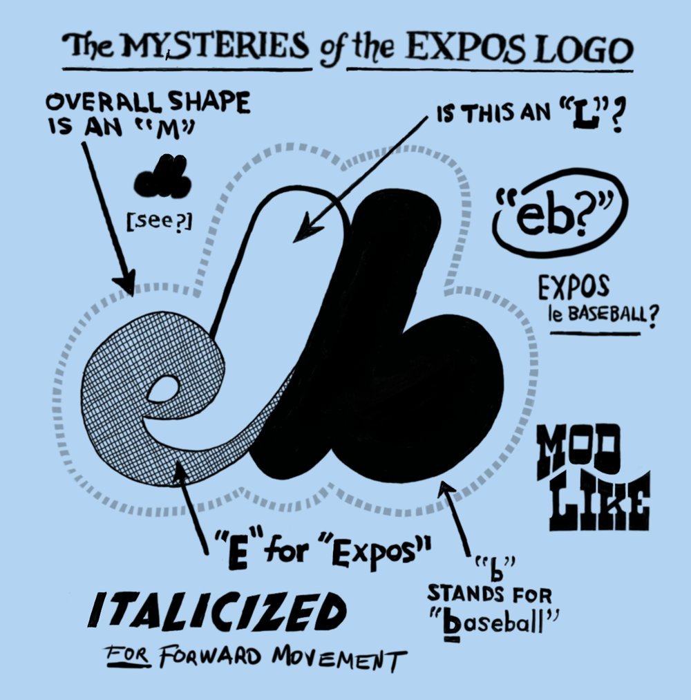
This logo is a play on the old Montreal Expos logo.
Did You Know?
The Expos logo consists of the stylized letters "eb", which stands for "Expos Baseball". When taken as a whole, the logo forms a large "M", representing Montreal.
Rendezvous Crew (‘Vous Crew)
Baker Newby Bearisters
And finally, while not a softball logo, here is a logo I created for a local law firm for their staff to wear at various sporting occasions (look for them at the CATT Volleyball Tournament fundraiser). They wanted to go with a logo that paid homage to the old Vancouver Grizzlies.
“Molly’s Comedy Cabaret is a musical variety show featuring the power house vocals of actress and singer Molly Wilson”. I stole that quote from Molly’s website https://mollyscomedycabaret.com/ 😉
Molly wanted a logo that evoked a vintage neon cocktail lounge bar sign. We tried a couple neon sign fonts and quickly settled on a font that her and her team liked. I was then able to modify the font to emulate how letters on a neon sign don’t actually touch or overlap each other. Molly also wanted a cocktail glass to replace the Y in her name.
My friend Trina started her own coupon book business in Kamloops, BC and needed a logo asap!
I quickly put a bunch of simple text-based concepts together using a cyan, green & black colour scheme:
Trina wasn’t too keen on this colour scheme but did like components from a couple of the concepts. She suggested perhaps using a dark blue and orange colour scheme (which as it turns out, is a fabulous color combo!). Also, the coupon book comes in a vertical format so she suggested we use stacked words to better fit the cover page. After a bit of back-and-forth, here’s the final logo we came up with…
If you live in the Kamloops area, check out The Big Deal Coupon Book Facebook Page:
My friend and former ass-kicker (aka personal trainer) has retired from the fitness game and is taking on a new business of creating all-natural homemade dog treats. She is an avid lover of Siberian Huskies and wanted a logo that incorporated one of these beautiful creatures.
After a bit of back-and-forth trying out different artwork, fonts & business names, here is what she settled on:
Working with Laura, the owner of Little Barn Yoga & Wellness, we came up with this soft blue logo comprised of simple brush strokes to portray a lotus flower in a barn.
A friend of Laura’s had made her this beautiful reclaimed wood sandwich-board sign so we incorporated the font style and layout into the final logo.
The School District in my hometown of Bella Coola, BC had a logo contest in which local First Nations artist, James Mack Sr submitted a couple sketches which were eventually chosen as the winning design.
My sister, who works for the School District, asked if I could incorporate the mouth from the sketch on the left and combine it with the sketch on the right. This was a fun exercise of overlaying and aligning the images on each to get the best of both worlds! Here is the result…
The Soroptimist International of Chilliwack club strives to improve the lives of women and girls through programs leading to social and economic empowerment. Named after long-time member, Heather Rollins, the club launch a new program in 2019 called Heather’s Hope Chest. This program provide’s women and young girls everday household items to help with transitioning to life on their own.
The club wanted a logo that conveyed the program’s mission along with maintaining the club’s colors. The logo also incorporates the capital ‘S’ of the Soroptimist logo on the chest as well as in the text.
My friend started his own Geotechnical & Civil Engineering firm and needed a logo to represent his company. He named his company Out of the Box Engineering and initially came up with a logo himself to include on the title block of his drawings
Initial Out of the Box Logo:
I was asked if I could provide him a new logo that could he could use on his drawings, letters, reports and business cards. After presenting a variety of logo options that played on the “Out of the Box” theme, we came up with a simple play on a 3D optical illusion box that can be interpreted a couple ways. Depending on how you look at it, you could be either looking at the box from above or below :)
I was honored to create a business logo for this local talented photographer! When designing this logo, I wanted to create a graphic that could be isolated in part to be inserted as a watermark in photos.
LMV Cleaning is a residential and industrial cleaning business started in 2019. Owner/operator, Lauren was looking for a logo that incorporated a cartoon likeness of herself. Not being cartoonist or caricature artist myself (which is something I would really love to get into) led me to scouring the stock images sites for an image that could be manipulated to suit. After a bunch of back-and-forth design reviews, we settled on a 1950’s retro-style logo that we were both pleased with.
For more info on LMV Cleaning, please check out their Facebook page:
This logo was initially created for Volunteer Chilliwack and was rebranded when the program was expanded to include communities from Abbotsford to Hope. It symbolizes the “Green Heart” of the Fraser Valley along with the welcoming and open arms to all volunteers.